Thursday 26 April 2012

Highly Detailed Finished Piece - Figure Drawing Showing Anatomy


Life Drawing of a Non-Human Anatomy - Final Piece

The aim for this drawing was to draw the anatomy and for it to be a highly detailed finished piece. I chose to draw a non-human anatomy and draw my pet Chihuahua because the anatomy to an animal is totally different to that of a human and it will be good practice for me to be able to draw the anatomy for both humans and animals.

I had her standing in the garden and for a brief few seconds she brought her front, right leg up so I was able to quickly capture that moment. I had her stand so I had a foreshortening vantage point. This means that the front of her body and head appear to be quite a bit larger than her back end. However, this also makes for a more interesting image and with this vantage point I was also able to pick out her muscle structure in her lower legs and also her front legs and chest.

There was very strong, natural light with this being outside and this caused there to be very different gradients of shading that shows her fur, joints and muscle structure. With using charcoal I was able to blend all the different shading together. However, I feel this makes her fur look to smooth and although she has very short hair anyway it is unclear what the texture of her fur is like. I would have been able to pick out all the little details if I were to use pencil however; with an animal it is hard to keep them still, which is why I used charcoal because it is quick and easy to get the overall structure of her anatomy down before she moved.

To improve this drawing I would have liked to have been able to draw the structure of her paws more accurate. This was difficult because the grass was covering a lot of her paws causing poor visibility. I would also have liked have made her fur more realistic and believable; I found this very difficult using the charcoal.


Highly Detailed Finished Piece - Still Life Drawing Showing Composition


Still Life Drawing Showing Composition - Final Piece

The aim for this drawing was to work out a composition with a few various objects to make a still life scene. I chose these objects at random that complimented one another to make a good image.

The main focal point in this drawing is right in the centre of the page this is because I drew these objects looking down on them so all the objects in this image shrink in slightly smaller the nearer to the centre they are. This is more obvious with larger objects like the perfume bottle, as it is clear that the top is much larger and it gradually gets smaller working down to the bottom of the bottle. There is also a curve that starts from the mirrored stand and reaches over the top of the bottleneck and over the top of the decorative box, which also matches the curve of the top of the sunglasses, that joins up with the oval bracelet box. This makes a great focal point within this image.

There is only small, subtle shadows within this drawing and nothing that stands out to much. This is because there wasn’t a great deal of light to cause any hard shadows. This makes the tones of shading all quite similar in this drawing.

Many of these objects are shiny and reflect the light of them to create an interesting image. The sunglasses are a great example, as they are mirrored glass and reflect what is in front of them. This makes the sunglasses a great focal point within this drawing and draws the viewer’s eyes towards them.

I arranged this composition so that there would be no kissing objects but also I noticed that all the objects were grouped close together. However, I liked this composition so I added in a few extra objects in the background to balance out the whole image and I think this works really well as it brings the whole image together.


Highly Detailed Finish Piece - Showing Natural Elements and Buildings


Landscape Drawing with Natural Elements and Buildings 
- Final Piece

The aim for this drawing was to draw a piece of landscape and for it to be a highly detailed finished piece. I used charcoal to create this drawing as a lot of the building had very dark features and I thought I would be able to get an older feeling with charcoal rather than pencil.

It was a very gloomy day, which makes a lot of the features of the building very dark with little highlighted areas. I chose a good vantage point because with my view I was able to see the different levels of the building as well as the main features, which are the very large chimneybreasts. This vantage point also showed a slight foreshortening view of the building as it gets smaller the further away it is. This was a very interesting building to draw as it has nice, complimentary shapes and with the different shading of bricks creating this building it makes for a very interesting drawing. With charcoal I was able to pick out the colour in the bricks, which show various different levels of gradient that contrast from one another.

To improve upon this drawing I would have worked out my measurements more accurately as I missed of the top of the second chimneybreast and had too much wasted space at the bottom of my drawing. I also struggled with some of the features of the building like the windows, as I don’t feel these are an accurate portrayal of what they are really like and show no detail in them.


Week 12 - Colour in Lanscapes


Colours in Landscapes, Excursion to Todmorden

Using coloured pastels I created this 30 minute drawing focusing on the colour that create it. I chose this building as it good form and a few colours that I would be able to pick out.

I noticed that even though it was a gloomy day and there wasn’t an immense amount of light to create hard shadows and highlighted areas that will show more colour I was still able to pick out colours that would not be expected to be there. There were different ranges of colours like blues and purples contained in the roof tiles, which make them, stand out more from the contrast of browns and blacks. I picked out the shading that I could that would make the building stand out more with contrast to the sandy coloured bricks. This makes more of a 3 dimensional view as it adds some depth to the picture.

To improve upon this drawing I would have liked to be able to get more of the background in to make this whole drawing complete. This is term would add more colour into the drawing and contrast well with the plants that I have drawn in front of the house. I also feel that there are a few curves in this drawing that should have been straight lines which I would have liked to have improved upon.


Saturday 21 April 2012

Week 11 - Colour in Landscapes


Colour in Landscapes at my Local Beach

This is a 30 minute colour drawing using coloured pastels at my local beach. I chose this landscape in an evening because the sunset creates great tones of colours upon the buildings and upon the water. With the sun setting it changes the colour of the sky to tones of orange and yellow and reflects this upon the water. With the sunset behind the buildings it creates a very dramatic scene and the building appear to be pretty much entirely black with the shadow of the sun.

With using colours it makes the drawing more dramatic and immediately draws your eyes to the darkness of the buildings because they stand out with the colours of the sky and sea.

When looking at the colours I noticed that there were colours upon this scene that I didn’t expect there to be. There were some blues that were reflected from the sky into the water but also with the mixture of blue, oranges and yellows I also found that these colours create some purples in the background of the scene creating a whole range of tonal colours upon this drawing.


Wednesday 18 April 2012

Week 10 - Classical Interior Architecture at the Alhambra Theatre


Classical Interior Architecture at the Alhambra Theatre

This is a 40 minute sketch of an interior of the Alhambra Theatre. With this vantage point I was able to see an entire space of different elements of this classical interior and with a lot of detail in this classical interior it was hard to get it all accurate.

There is a lot of very dark value of lighting in this drawing as there was no natural light in the theatre and very dull, un-natural lighting lighted the room. This created immense shadows upon the details of the theatre and create very different tones of light where the gradient of lighting changes very sharply from light to dark. This makes the drawing very dramatic because it also makes it possible to pick out all the little details within the architecture that may not be visible if the room was brighter.

To improve upon this drawing I would have spent more time on the details of the interior to make them stand out more to make this drawing more dramatic and make sure everything is perfectly accurate. 

Week 9 - Modern Architecture at the National Media Museum


Modern Architecture at the National Media Museum

This is a 30 minute sketch of an interior of the National Media Museum. I chose my vantage point with a part of the building, which would be interesting to draw. The vantage point I chose was very complex because there were different elements to this, which make up the modern interior. With the large glass, panel windows and the interior being very wide and open there wasn’t a great deal of shadow so a lot of the colours and tones in this drawing are all very similar.

With the immense amount of light in this picture it made the value of shading very simple and is quite difficult to see the different elements to this drawing. The glass barrier and handrail breaks up the back wall scene and the huge glass window because your eye if directly drawn towards the handrail which spreads horizontally across the entire page.

With different lighting it would make it possible to see this more clearly because there would be a greater value of shading added to this drawing and would make a lot of the features stand out a great deal more.

Thursday 22 March 2012

Week 8 - Non-Human Anatomy


Figure Drawing of the Non-Human Anatomy

This is a 20 minute sketch I did of a Toucan bird at the Leeds City Museum. This drawing shows an accurate sketch of a Toucan bird and for me I am happy with the proportions of this drawing and how it looks.

From the vantage point I had I was able to get a front on view of the bird however, with the birds head slightly turned it makes for a better drawing. From this angle I was able to pick out the detail within the birds face and beak.

The colour of this bird was mainly all black so it was hard to pick out detail and shading within the birds feathers. However, even without the shading it is clear what this drawing is. To finish of this drawing I also added in the branch, which the Toucan bird was standing on. I was also able to pick out the shading on detail within this branch, which finishes of this drawing.

Week 7 - Posture, Pose, Balance & Weight


Figure Drawing showing Posture, Pose, Balance & Weight

These were 5 minute sketches showing the movement of the models body as she comes out of one pose and into another. These drawings show good proportion and balance with all her weight distributed to her legs and feet.

I like the outcome of these quick sketches however; I was unable to get the models entire body to fit onto the page and ended up missing off her lower arms and hands, which would have finished the drawings.


Figure Drawing showing Posture, Pose, Balance & Weight

This is a 10 minute sketch showing both an open and a closed pose. This is because her legs are crossed and twisted together and her left leg is also pulled in very tight to her buttocks. However, her upper body is very open as her right arm is shown to be placed far away from her body leaving space between her body and her arm.

If I were to do this drawing again I would like to get a more accurate sketch of her left leg. I think her leg looks slightly out of proportion to the rest of her body and maybe slightly in the wrong place. I would also change the size of her hips and buttocks and make them slightly wider to make her figure look less manly and more female.


Figure Drawing showing Posture, Pose, Balance & Weight

This is another 10 minute sketch showing a very open pose. Her left arm is pulled way back over her shoulder and her right placed very far away from the rest of her body.

I think this drawing shows good proportion, balance and weight, as it is clear to see she is lying down on something and not floating in mid air. This can be seen from the pressure on her buttocks where it has been slightly flattened and stretch out from the pressure and weight of the rest of her body. You can also see from the position of her breasts as she is lying down they are slightly drooping down to the side of her body.

If I were to change this drawing I would try and improve on her feet, as they don’t look quite a natural shape or position.  I would also have liked to get more accurate detail in her face.


Week 6 - Anatomy & Movement


Figure Drawing showing Anatomy & Movement

This is a 30 minute sketch focusing on the movement of the human body. I had my model sit in this position because it gives the gesture of movement as it is not a normal sitting position and looks like his is in the middle of a series of different poses.

I was able to get the pose of my model to show he is sitting and where is weight lays in his bum and legs. With proportions I think I got them slightly wrong in this drawing, as his posture doesn’t look quite right. His shoulders look too wide for his body and his upper body to me seems to short and stocky.  The positions of his legs were at a difficult and foreshortening angle, which made them tricky to draw. I think if I had drawn his legs slightly longer and slightly bigger it may have brought the whole proportions of his body together.

Thursday 8 March 2012

Week 5 - Basic Anatomy


Figure Drawing showing Basic Anatomy

This is a quick 10 minute sketch of the human body. The model is standing in a very open pose and it is clear to see that he is standing with his chest puffed and head held high. This is because of the force shown on his upper shoulders and the pressure on his hips.

I think that this drawing is mainly all well in proportion although I think I may have drawn his legs a little short. However, they have good form to them and it is clear to see which way his feet are facing.

There are some changes I would make to this drawing if I were to do it again these would be to make sure the entire body is in proportion and extend his legs a little and to also get more accurate features in his face and also his hands.


Figure Drawing showing Basic Anatomy

This is another quick 10 minute sketch with the model showing quite a closed pose. This is clear to see because his legs are crossed and although his arms are far apart they are pulled in quite close to his body.

The body shows a twist from his shoulders to his hips with all his upper body weight resting upon his arms. This is evident to see because his shoulders are pushed up high and his neck and head slightly lowered. 

I am pleased with this drawings however, the size of his hands and slightly out of proportion as they look to small for his body and I also got the joint in his left elbow wrong as the upper part of his arm looks to short and the lower part of his arm to long.


Figure Drawing showing Basic Anatomy

This is a 20 minute sketch of a model. He is showing both a closed and an open pose in this drawing. This is because he has pulled his left leg in very close to his chest but at the same time his right leg is very spread out. He also has a twist in his right leg showing the bottom part of his foot. This makes it very difficult to draw with both an open and closed pose with a twist.

With shading I was able to show the detail in his collarbone and also his chest bones. However, I believe I made his shoulders to wide for his body as well as his hips. This makes him look slightly out of proportion and makes him look a lot wider than what he actually was.


Week 4 - Foreshortening and Extreme or Difficult Angles


Still Life Drawing focusing on Foreshortening and 
Extreme or Difficult Angles

This is a 45 minute sketch of an object from a foreshortening angle. With the vantage point I had the object seems to be compressed into something a lot shorter when this is actually quite a long object. 

Although the object is thinner on one side to the other the object also gradually gets slimmer the further away it is. This gradual thinning out shows that the object is further away and brings life to the picture.

If I were to do this drawing again I would try and get the shape more accurate because it looks a bit distorted on the top of the object making it look not quite right. I would also have liked to have been able to get better shading for the metal parts of the object to really make them stand out.

Tuesday 21 February 2012

Week 3 - Composition Focus


Still Life Drawing focusing on Composition

This is a 40-minute sketch of a composition in which my group and I created. The aim and focus of this study was to concentrate on the composition of the relating objects.

This composition is well balanced with the objects not being all bundled up together but split up into two groups. These two groups of objects create a contrast of light and dark. The glass jars reflect the light creating transparent reflections and light shadows. This is also a very open area with these two objects being placed farther apart from each other and also the lines of the cloth being much more straight and open.

This differs from the other group of object which have a dark contrast with them being very dark objects. The area and composition in which they are in is also very closed. These objects are packed very close together allowing them to overlap one another. The cloth also has very short, sharp folds within it creating hard shadows within the cloth, which the objects are rested upon. The theme of the dark transition carries on throughout the stools, which lay underneath the table. On the left hand side the majority of the stool cannot be seen because it is covered with the pale cloth, which brightens up this whole side of the drawing. However, on the left hand side the stool is visible continuing with the dark contrast.  This contrast is broken up by the pale tabletop, which is pleasing to the eye as the contrast of light and dark work very well together.

The pale material of cloth that spreads across the entire table connects these two groups. This joins them all together as one composition rather than two.

If I were to do this drawing again I would make sure I got all my measurements correct as I feel that the glass jars are not in well proportion to one another. These two objects were supposed to be the same size however, I got my proportions wrong and as a result of this one jar looks considerably smaller than the other.

Wednesday 8 February 2012

Week 2 - Mass, Form & Shape


Still Life Drawing of an Arrangement of Objects
'Plain Contour Drawing'

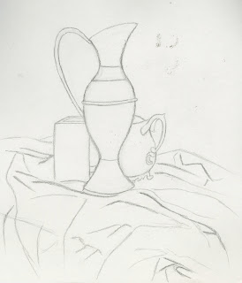
This is a plain contour drawing of four different objects.  In this study we concentrated on the lines and left shading out completely. This enables the eye to concentrate on the basic shape of an object rather than the light and shadow. 

Focusing on the basic shape of these objects gives the drawing a more plain but accurate finish as it is much easier to get the lines in the correct places and easy to correct a mistake. However, with having less detail in a drawing it is sometimes hard to understand what an object is. This is the case with the drapery as it can just look like scribbles on a page.


Still Life Drawing of an Arrangement of Objects
'Plain Contour Drawing2'

This is another plain contour drawing using the same objects but with a different vantage point. The composition of these objects were set up with the observational line falling across the top of the objects from the very tallest to the very smallest. This observational line leads the eye to look at the composition as a whole rather than just focusing on the single objects.

If I were to draw this composition again I would choose a vantage point where there were no kissing objects. I noticed while drawing these objects that the edge of the jug and the top of the plastic tube had lines that were touching. This distracts the eye from the other objects and leads you to focus more on these kissing objects.


Still Life Drawing of an Arrangement of Objects
'Negative Space Drawing'

This is a negative space drawing. Rather than drawing the objects, I picked out the shape of them and shaded in the areas using a graphite stick that were negative and kept the shape of the objects white. This gives the drawing a whole new viewing perspective.

Even with no form it is clear to see what most of the objects are and the darkness of the negative space makes the shape of the objects stand out even more.


Friday 3 February 2012

Week 1 - Still Life


Still Life Drawing of a piece of Drapery, Table & Stool

This is a 40-minute sketch of a chequered piece of cloth draped over a wooden table and stool.  With my chosen vantage point I was able to see the cloth and how it fell in different directions as well as part of the table and stool.

To show that the cloth was not just falling vertical to the fall I picked out the way the chequered stripes fell using charcoal and by smudging in darker areas I was able to pick up upon the shadows and using my putty rubber picking out the highlighted areas. 

For me the main focus was to show the movement within this piece of cloth by focusing on how the chequered pattern changed and dispersed in all different directions. Some of the cloth was folded over one another creating hard shadows which differ from the areas where the cloth fell straight and the natural light from the windows hit it. The chequered pattern changed from horizontal to vertical as well as being in-between. I picked up on this by shading the patterns from the checks different from the ones going up to the checks going across.

If I were to do this drawing again I would have added in more detail to the folds and the creases within the cloth and I would also have added in a background to this drawing.